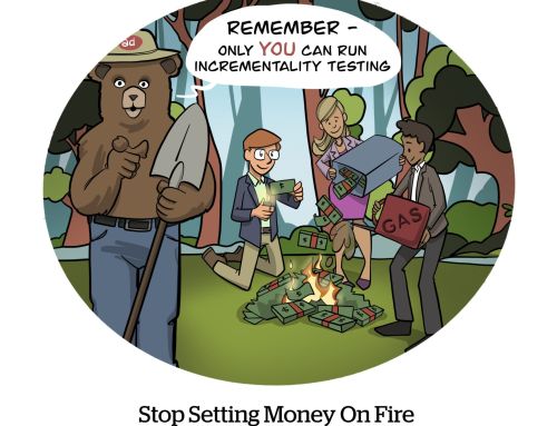
If your marketing budget only allows one major project this year, then conversion optimization and a website redesign will probably be among the top candidates. The question is which is more important for your business, and what will have a bigger impact overall. In this article, I’ll break down the decision and help you get started:
What’s the difference between CRO and a redesign?
If you only have a superficial understanding of the two topics, you might not know what really separates them. In reality, there’s a lot of overlap between conversion optimization and a website redesign.
In fact, when a business approaches conversion optimization, it’ll often redesign its site in the process. Likewise, redesigning a website should have a positive impact on your conversion rate. Before concluding that the two are synonymous, let’s refer to this Marketing Land article, which spells out the difference between them:
“When a business says, ‘Let’s redesign the website,’ they do it to improve their online fortunes, to increase customer acquisition and retention. Website redesigns are just big, fat, sloppy conversion optimization exercises. It’s hard to resist a redesign, though. When a new CMO comes into the business and offers the team a big budget to redesign, how can they turn it down? Nothing will divert the attention of a struggling marketing team more than a Hollywood-style redesign.”
In other words, the difference is where you lay the priority. If you choose to redesign your site, you’ll mostly focus on its aesthetics. This might have an impact on your conversion rate, but it’ll be a side effect. On the other hand, if you opt for CRO, your web design will improve, but it won’t win any awards.
And this isn’t just semantics, either. This choice will have a ripple effect on all of your marketing results. If CRO is secondary to design in your strategy, you’ll miss out on chances to convert prospective customers. Keep in mind that when prioritizing your conversion rate, you’ll also need a decent design for an optimal user experience.
What needs to be changed?
Each company’s CRO project is substantially different because there are multiple factors to consider. Some businesses might not have to change much for a good conversion rate while others will have to start from the ground up.
The important thing is to have a holistic view of your project. It’s tempting to get caught up in the tiniest of details, but that often leaves businesses spinning their wheels.
A recent Forbes article explains this with a visual example. It argues that some businesses are essentially rearranging chairs around on the Titanic:
“While changing button colors and text is important, the big picture is more important. If you are tweaking away at a crappy site, you will have a well tweaked crappy site. More or less, you will have a Titanic with chairs that are arranged nicely on it. Focus on bigger tactics such as your website’s user experience, your credibility, and your mobile tactics. Once your branding, message, and delivery is fine tuned, that’s when you can ‘re-arrange your chairs.'”
This metaphor says everything that needs to be said. It’s what happens when you lose sight of your CRO project as a whole. Some people trick themselves into thinking that they’re making progress by “testing” their font color and typeface. While they’re disappointed with their results and sure that they’ll eventually find the right combination, they’re clueless that their entire site is headed for an iceberg.
Embracing bad test results
You know those people who surround themselves with yes-men? You know, the ones who ask for feedback and only accept one type of answer?
That’s how some people approach testing in the context of conversion optimization. They go into a test expecting a result and wouldn’t you know, they find exactly that.
A critical approach is more effective. This Business 2 Community article offers more contrarian advice, which suggests celebrating bad or negative results from testing:
“While that person is caught up on why their idea didn’t work, you should be moving them towards the fact that something outperformed what they thought would happen. Not only does this mean the company will now make more money, but it means that you learned something new or re-evaluated false knowledge. That isn’t a bad thing. That’s the best thing that could happen.”
Ok, so something went wrong, and that usually spells trouble. But another way of looking at it is that something else outperformed your original plan. In your failure, you stumbled upon an alternative technique that works even better.
Think of how this applies to landing pages. You might think that your ebook, which you put tons of time and effort into, will be the trick to getting the contact information of prospective customers. But maybe you misunderstand your target audience. Maybe they don’t really care about glossing over an ebook and would rather just speak to you one-on-one. Your test results might initially disappoint you because your ebook isn’t effective, but they’ll also steer you in the right direction. In the end, that’s the whole point of testing, isn’t it?
Choosing between conversion optimization and a website redesign shouldn’t be difficult when you break things down into its separate parts. Look over your goals and predict where each option will take you. If you want to convert more users and choose CRO, then be prepared to take a step back, evaluate your entire strategy, and get used to testing from a critical viewpoint.


